Designing basic UX for the maritime trader game
Last time I came to the conclusion that without UX improvements, my game is not playable, this is not a minimal playable game in any sort of way. Today, I made a fast iteration to bring the game UX to the level I can test it with users.
Product, design, or coding: Always start with the big picture
Any design, development, to product management work, should always start with the big picture. Spending a lot of time and effort on the details of some feature, important as this feature may be, is almost guaranteed to become a waste of time, as you find out it does not fit with the bigger image.
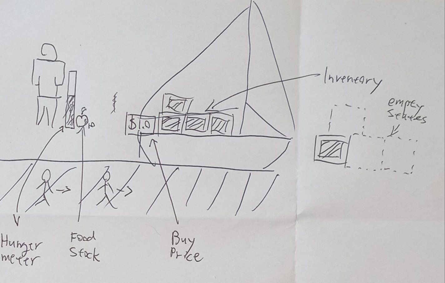
I started with a high-level pen and paper sketch (see image). First, I thought to represent boat inventory with crates, and places for crates. Then, I thought to have some human figure represent the boat crew, with hunger and food-related info. Regarding money, I thought to have a sign on the boat with buy price info but did not have a clear idea of how to visualize it.
Speed up delivery time: reuse what you can
For me, the hands-on process of designing UX/UI in Unity is always much more time-consuming than the code and movements. So I try to reuse as much as I can UI elements and UX concepts that have proven to work well in previous games I made. Reducing delivery time towards a working software is something that you should always do. This is basically the number one tip for indie game developers.
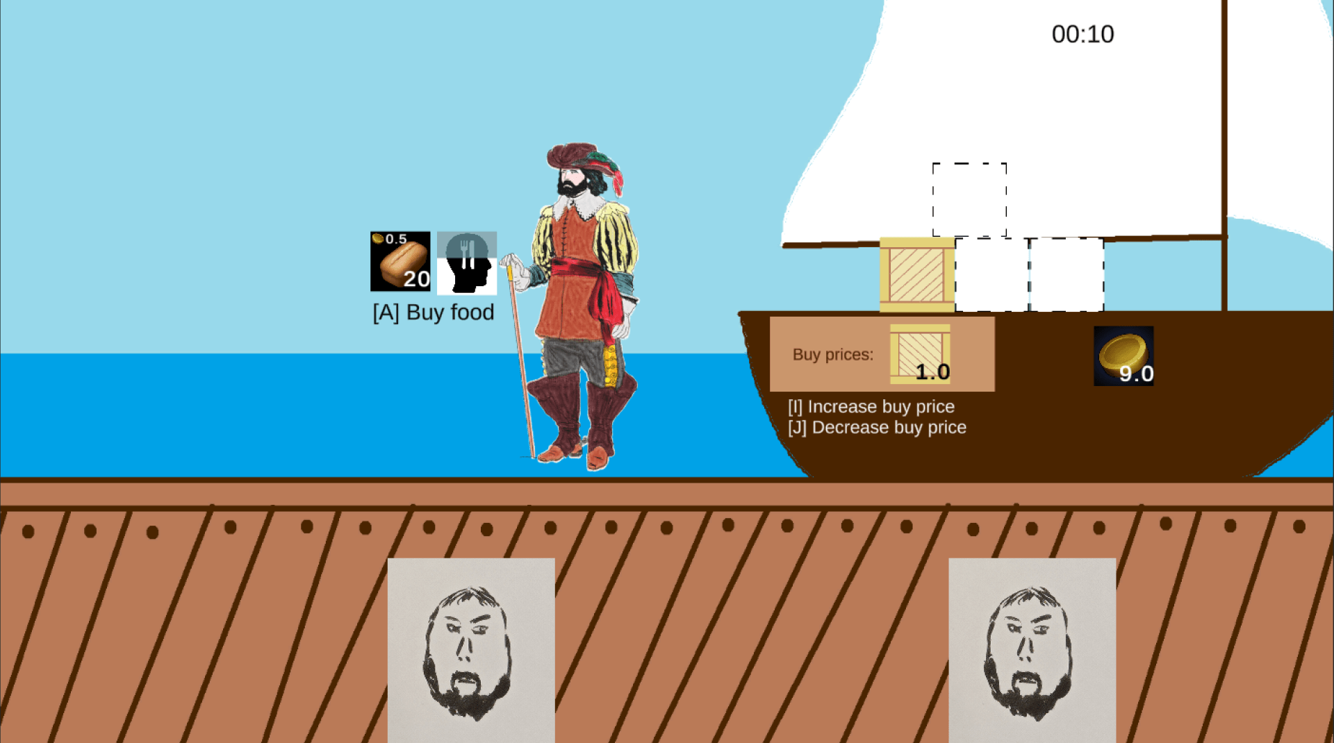
I used a slider to represent increasing hunger. I also used a common convention of having a resource with a number at the corner to represent the food inventory, money, and the carte buy price. I did have one innovation, instead of having a hunger slider based on color with a ‘Hunger’ label next to it, I found an icon that can represent hunger, and made the slider fill it with time.
New Paragraph
Share if you think it's good
Don't miss a thing
We promise to only send you the good stuff. No spam.
